Designing Adaptive Document Forms
This article introduces the various options that will assist you in designing a basic Adaptive Form. For the sake of simplicity, let us take the example of a newly-created blank form (learn how to create new Adaptive Forms).
As you successfully create a form with a title, you will see a white rectangle in the Composition area (as shown in the below image). Also observe that the Document Structure panel shows "Layout.Section root".
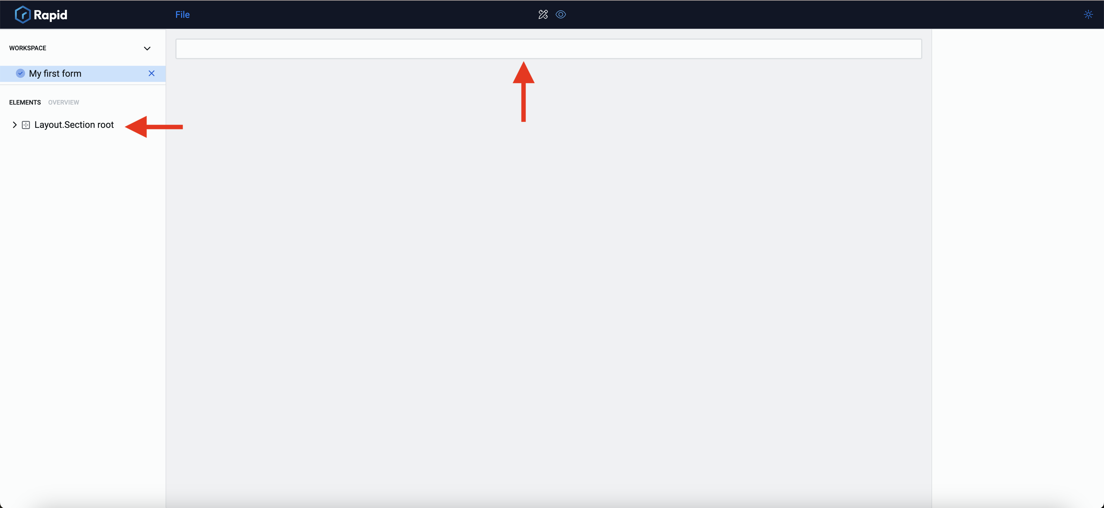
The white rectangle corresponds to the root section of the layout. As we will discuss now, all the elements and sections are added under this root section.
Configuring the Root Section
Before we get into constructing our first form, the first step is to be aware of the Root Section properties. To learn how to configure attributes of root section, click here.
Configuring Connections with Data Table(s)
You can establish connection between the Adaptive Document and data tables. A connection with a data table means that the system can fetch or feed data directly from the form, to the data table.
To learn how to configure connection with data table, click here.
Adding elements to the root section
Although you can have label heading set up in the root section, for the sake of simplicity, we consider a blank composition area without displaying any heading or description. The composition area will show only a white rectangle.
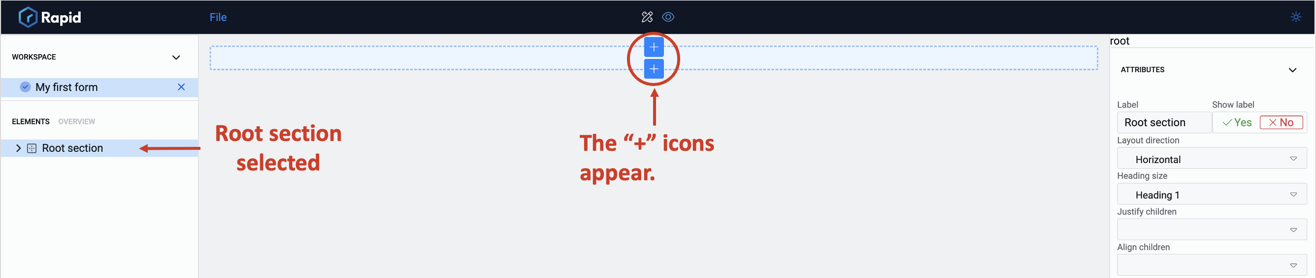
Observe the rectangle shows two "+" icons, one each at the top and at the bottom of the rectangle.
In the above image, the root section has been selected and therefore, the rectangle in the composition area appears highlighted with blue and the two "+" icons are visible.
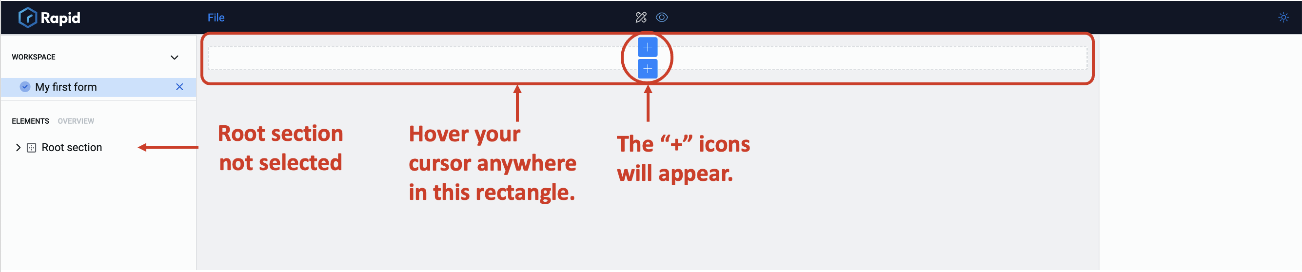
If the root section is not selected, hover your cursor over the rectangle and the two "+" icons will appear.
The "+" sign represents that a form element can be added either above or below the highlighted section.
Let us assume that we click the "+" sign at the lower part of the rectangle.
On clicking the "+" sign the element picker section opens.
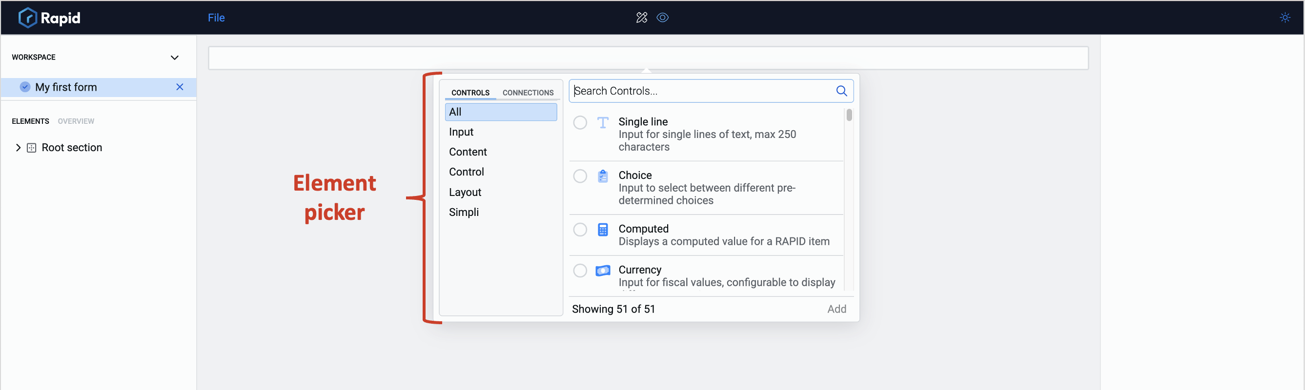
The element picker allows you to select elements that you want to put on your document. There are 51 different elements in the element picker (at the time of writing this article) that are available by default.
Each element has its own properties and can be configured accordingly in the element configuration panel. However, the number of elements available in the element picker vary based on the connections.
To learn more about element picker features, click here
Understanding the various elements
The element picker will allow you to add elements to your Adaptive Document, however, you still need to make the decision of selecting the right element that suits your requirement.
To learn more about each element's features, click here.
You can add or delete multiple elements at once, and also modify their sequence, position, and appearance on the composition area.